
CTA Banner
Overview
A large banner with a headline and call-to-action buttons.
When to Use
Use when you want to call out an important action you want the user to take, or an action the user expects to find easily.
Content Guidelines
| Content | Description | Max Chars. |
|---|---|---|
| Heading* | Short copy that grabs the user’s attention. | 56 |
| Subheading | Short copy that expands on the heading. | 100 |
| Background Image | Optional background image for the component. | N/A |
| Call to Action(s)* | Call-to-action buttons. | 25 |
*Required content.
Example 1 General Audience Default Tone Color Palette Option 1
Example 2 General Audience Default Tone Color Palette Option 4
Example 3 Academic / Traditional Audience Default Tone Color Palette Option 3
Example 4 Prospective Students Audience Loud Tone Color Palette Option 3
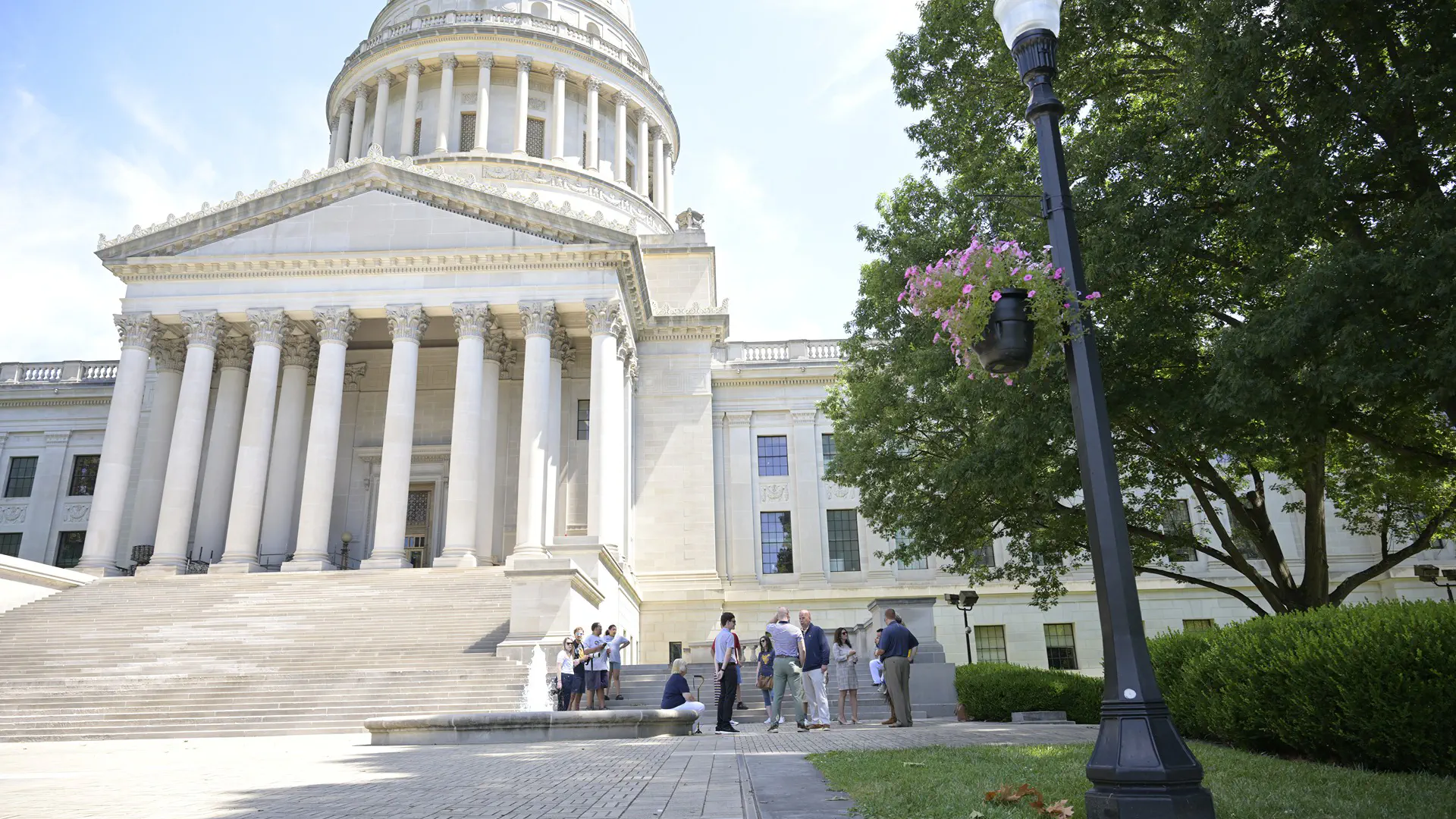
Example 5 General Audience Default Tone Color Palette Option 1
Heading
Subheading goes here.
Example 6 General Audience Reserved Tone Color Palette Option 5
Heading
Subheading goes here.